ShopDreamUp AI ArtDreamUp

Deviation Actions


Description
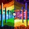
Join me in my new project, where I apply my earliest digital style -Five Foliages- to some of my favorite trees. (Also some inspiration from Leonid Afremov)
This one is a tribute to the Green Mountains, where I grew up and spent most of my time climbing trees and fighting imaginary armies with stick weapons. The beauty of a single pine tree rising above the forest continues to captivate me. And you?
Others:
Majestic Maple, Oak in Fields of Lavender, Storm Clouds over Miami, Sunset at Cherry Lake, The Lonely Willow
Prints now available!
Fine Art America
Image size
2001x2997px 1.38 MB
© 2016 - 2024 scorpion016
Comments14
Join the community to add your comment. Already a deviant? Log In
Very interesting. I have no idea how you did this, you mentioned a CC0 image and a multitude of filters and tools. I'm curious, is there any way I can see the referenced image?
I do like the style, but there are a few chaotic elements that I'm less sure about... Personally, I find Majestic Maple to be far superior for a number of reasons. The most obvious one is that the above image is that there's too much going on. That would be fine if it was only one object - after all, that's part of the style - but as opposed to Majestic Maple it took me minutes to figure out that the stuff around the centre piece isn't random noise but in fact more trees. It might work if it was truly random around the centre tree, but I was immediately bothered by some pattern that I was unaware of at the time. The problem is that the colour distribution is not even and with partially contrasting colours it just doesn't look as good.
The style is amazing. It's like you had a cubist image made with wax crayons and then went over it with an iron. (I don't know if you ever tried it, but has such an interesting effect, similar to what you did here.)
I also like the distribution of complexity. There's an obious focus, surrounded by a relative calmness, framed by an explosion of colours. In my opinion, if you eleminated most of the green shades in the frame, it would look a lot more pleasing to the eye.
This is definitely you can and should work with more - it is already quite good, making one definite object stand out more and more over time and making conscious choices about the colours might make it better, I think.
ProjectComment